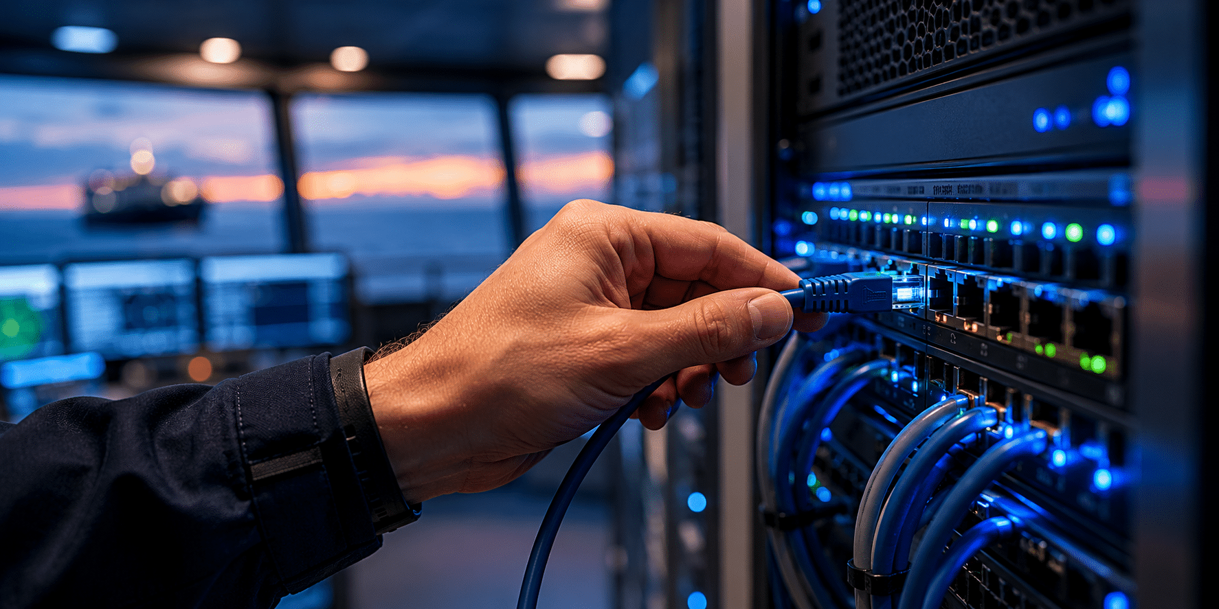
Shipping environments are complex by nature. Different roles need different perspectives, and what matters to one team is often irrelevant to another. Still, many systems try to present everything at once, creating dashboards that look powerful but are harder to use in practice.
That is where we see a shift happening. It is no longer about showing more information, but about making it easier to focus on what actually matters in the moment. The way a system is structured, and how easily it can adapt to the user, becomes just as important as the data itself.
With the latest updates to the Sea IT Portal, we have taken a step in that direction.

The portal now introduces a new landing page, where users can choose how they want to start their day. The default view is a combined dashboard with status, map, and news, giving a structured overview of operations. At the same time, users can choose to land directly on a more focused view, such as statuses or news, depending on what is most relevant to them.

The dashboard can also be customised directly. Modules can be shown or hidden, cards can be reordered, and the layout can be adjusted to match individual workflows. For those who want more control, a custom grid layout allows the interface to be shaped in a way that fits how the system is actually used in daily operations.

Alongside these changes, we have introduced new features to improve visibility across the fleet. A data consumption card highlights which vessels are using the most bandwidth, either based on raw usage or in relation to defined limits. A camera module presents a selection of live images from vessels, creating a more direct connection to operations. In the operational overview, a new GPS indicator highlights vessels with missing or inconsistent position data, helping identify situations where data may look available but is not fully reliable.

The news section has also been expanded. In addition to Sea IT updates, it is now possible to include external maritime feeds, giving a broader context without leaving the platform.

What ties all of this together is not a single feature, but a shift in how the platform is designed. Instead of a fixed dashboard, the portal is moving towards a more modular and user-driven approach. The goal is to give different roles access to the same foundation, while allowing each user to shape how that information is presented and used.
This is only the beginning. As new widgets and capabilities are introduced, the level of control will continue to increase, making it easier to adapt the platform to different roles, teams, and ways of working.
Because the goal is not to show more data. It is to make it easier to act on it.